The Pareto Chart is a classic – it has history, and it has applicability. There are a few of these basic tools used by those who analyze a business, they are for the most part very easy to understand. But as simple as they are, they can be quite powerful.
We’ve talked about the disciplined problem solving approach called 5 Whys; that’s one of them. Today we will talk about Pareto Charts.
Che Cosa è Pareto Chart?
You may even have heard of The Pareto principle, or what is more commonly known as the 80–20 rule, or “The vital few, and the trivial many”. Meaning that, in many cases, roughly 80% of the effects come from 20% of the causes. Math comes into the scene with something called the power law of distribution – but let’s just keep that … over here – for now.

The oft’ cited Joseph Juran (1904 – 2008) – the quality management evangelist (did you know his middle name is Moses?) is credited with suggesting the principle and naming it after Italian economist Vilfredo Pareto (1848–1923). Vilfredo noticed in the early 1900’s that 80% of the land in Italy was owned by 20% of the population – and he went on to his garden, finding that 20% of the pea pods contained 80% of the peas.
Turns out that there are examples in business, economics and civilization in general, as well as in the natural world. An excellent example is used as the basis for one of my favorite reads, The 4-Hour Workweek: Escape 9-5, Live Anywhere, and Join the New Rich by Tim Ferriss. He recommends focusing attention on those 20% of customers who contribute 80% of the income. And the extension of this is a recommendation to refuse to do business with those 20% of customers who cause the most trouble and take up the most time.
Here we will focus on the Pareto principle’s application in quality management. Or, the marvel of prioritizing targets of improvement, called the Pareto chart.
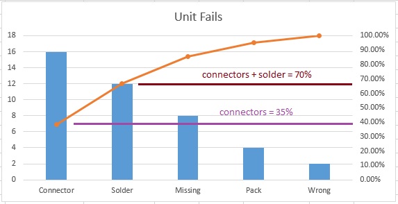
In the Pareto Chart, there are both bars and a line graph. Individual values are represented in descending order by bars, and the cumulative total is represented by a line above the bars. Like this:
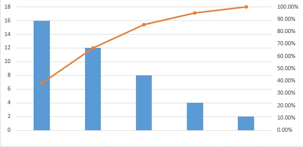
The bars are typically the various contributors to a problem. Larger bars represent more prevalent causes, and the line represents the cumulative effect on the whole problem for each bar; combined.
Let’s Build One
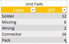
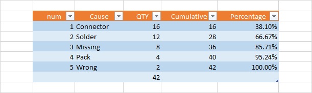
To build an example of our own, we start with the data. We’ll pretend we have some unit failures and we’ve investigated the various failure modes, and how many instance of these we find:
Pretty simple example, and maybe intuitively you know where your problem children are, but lets see how it looks in a pareto.
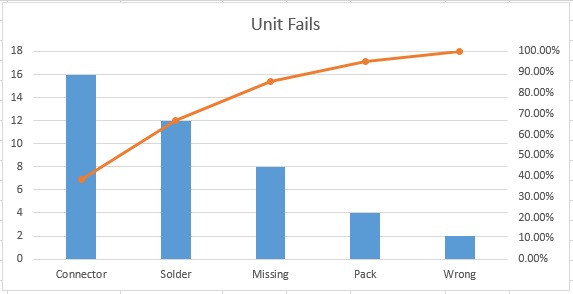
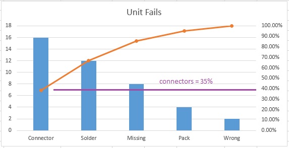
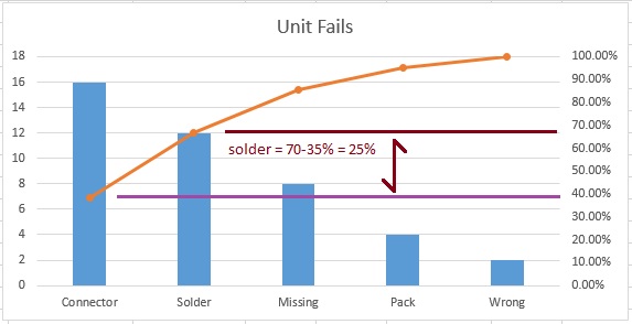
From this, it is very easy to see that Connectors are 35% of all problems, and if we were to correct both Connectors and Solder issues, we’d fix 70% of all of our current unit failures.
The other use for this type of graphical representation of “the big hitters” is that it makes it clear, when seeking buy-in, for example, where resources should be allocated.
Look at these slides for a few cycles – they’ll give you a bit more data on how to interpret the Pareto chart (you can click on the right edge to go to the next slide, hover to pause).
Strategically, once you’ve solved those two big hitters, you can run more data and make another Pareto – until only the small stuff remains. And nobody should sweat the small stuff.
So, there you have it. The Pareto chart – separating the vital few, from the trivial many.
One more thing, you may be inspired to attack an issue; grab some data and move it all into Microsoft Excel… I am sorry to report that Excel doesn’t have a “Make me a Pareto” button. There are apps (we used to call them “programs” – we were very old-fashioned) that will create this for you, and you will likely pay for the privilege, too.
But no worries – I can help you out. Next week I will show you step-by-step how to create a Pareto chart in Excel 2013.
Meanwhile, here is a hint for the bold:
See you next week, my friends, for “How to Make a Pareto Chart in Excel 2013” and the next Tool Tuesday!
Thank you, go forth and calibrate thyself.
Sal