Category Archives: Improvement

Sunday Summary

Here’s a look at the week gone by.

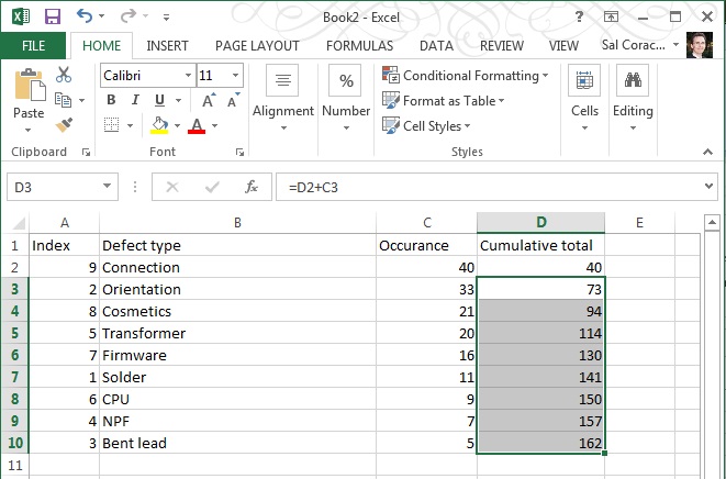
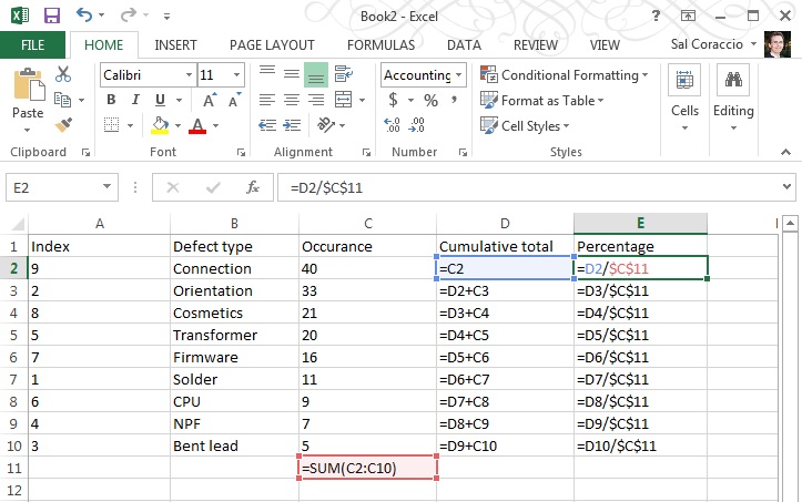
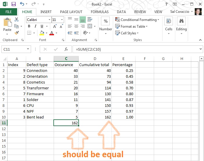
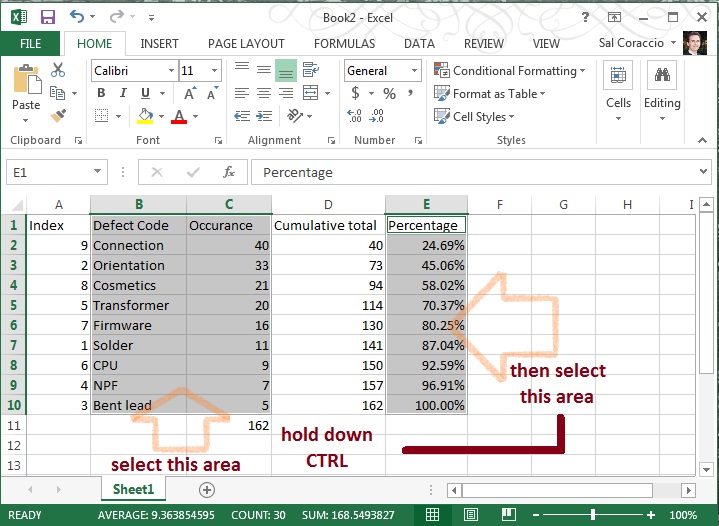
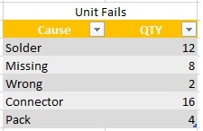
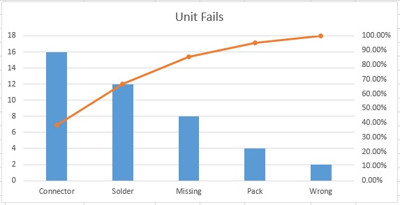
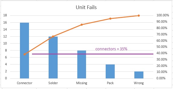
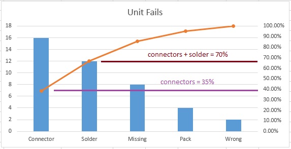
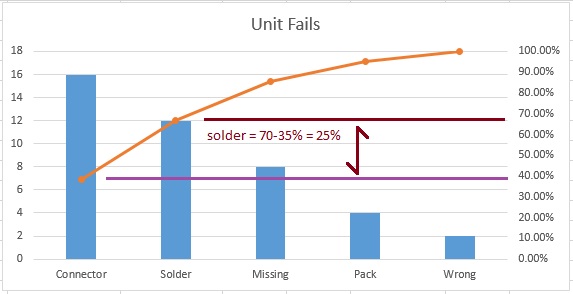
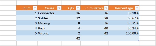
This week’s “Toolsday” brought us a tutorial on how to create a Pareto chart using Excel 2013, which may be helpful to some of you. You’ll find how to create one in other versions of Excel with a little Google-fu, but ours may be the only currently available for the latest version.

That was the extent of the formal posts this week, excepting tweets and Facebook updates. A large part of my week was occupied with a reCertification audit. This is, by the way, what happens after two yearly “surveillance audits” – you may remember we covered the audit cycle in an earlier post.

This company was actually very good – one of the better implementations I’ve seen as a point of fact. Thought I would spend a few moments listing a few bullet points on why this is so.

  • First, it’s a long-time implementation; they started their journey, albeit in a slightly different structural form, in the mid-nineties. That would have been the 1994 version of the standard. So, in a word, Experience.
  • Secondly, they have strong quality system leadership; a competent and vocal Management Representative who enjoys the technical and practical respect of those around him. Call that, summarily, Stewardship. This differs slightly from leadership, which some may call this and they would be still correct, if imprecise – in that a steward also helps operate the machine and knows how it works. It is vitally important that the leadership support the system, and that is truly a component of Stewardship and something at which this particular company also excels.
  • Thirdly, there is little difference between how seriously the formal management system is taken at the different levels of the organization. Soldier and general alike reference and follow the established processes and are actively concerned with improving them. Let’s call this Cultural Integration.

Most companies have some or all of these, and other nice-to-have’s, to varying degrees – but these folks are rock solid, “Best in Show” in each of these three. So, three keys to a successful, world class formal management system implementation: Experience, Stewardship, and Cultural Integration.

Would like also to make mention of another activity from the week, a meeting of the Granite State Quality Council. I’m planning on a dedicated post about the Council, but this event made recognition of two outstanding New Hampshire organizations.

There were presentations on these organizations’ best practices and lessons learned to help audience members improve their own organizations. Part of the night was devoted to recognizing the dedicated Examiners and Judges who participated in the program. It was my first experience with the Granite State Quality Council and I do hope to become more involved.

Looking forward to three audits next week: California, Massachusetts and good ol’ New Hampshire.

And I do hope you have a fulfilling week as well. Get some rest.

Sal


Pareto Chart in Excel 2013 – How To’sday!

a Pareto Chart in Excel 2013 isn’t a simple press of a button, as one might think. It isn’t terribly difficult, but there is some arrangement of the data needed before the charting can begin. This step-by-step guide will help you through it.

Step One : Defect Code Identification

You’ll need three columns for now, one as a counter, one with your defect codes and one for the number of occurrences of each type of defect. Like so:

step 1

The counter, by the way, is totally optional – I’m using it here to help make some of the sorting clear. Feel free to leave it out if you understand the nuances of sorting columns in Excel.

Step Two – Order by Occurrence; Descending

Arrange the defect codes in descending order of numerical Occurrence – Column C in our case.

step 2a

Be sure to select all columns prior to the actual sort, when asked (as above).  Now our chart looks like this. The “Index” column should be all out of sorts, now:

step 2b

Step Three – Add a column for cumulative occurrence

Basically a formula to add the cell to the one above it, getting larger all down the column – like in the capture below:

step 3a

Hit ENTER, then – to duplicate the formula for the cells below it, grab the corner of cell D3 and drag the box to the corner of cell D10, as shown:

step 3b

Your numbers should look like the image below, if it doesn’t then check your formulae.

  • D2 should be “=C2” [no quotes please!]
  • D3 should be “=D2+C3”
  • D4 s/b “=D3+C4”
  • D5 s/b “=D4+C5”
  • D6 s/b “=D5+C6”
  • D7 s/b “=D6+C7”
  • D8 s/b “=D7+C8”
  • D9 s/b “=D8+C9”
  • D10 s/b “=D9+C10

step 3c

Step Four – Calculate Totals, add Percentage

Calculate total of numbers shown in the Occurrence column and add a column for Percentage.

First, add a sum to column C; Occurrence

step 4a

Then add a formula to column E that uses the total you just made as shown below:

step 4b

Make sure your totals match (D10 should be the same as C11)

step 4c

Go ahead and format that Percentage column to be a percentage with two decimal places, like so:

step 4d

NOW – The numbers should appear as below (if you’re using this example as a first run – which is not a bad idea, right?)

ready to graph

We’re ready to make a proper Pareto Chart

Step Five- Select Columns

This may be a little tricky, so follow closely. First, using the mouse, select B1 to C10 (two columns), THEN – Without Clicking Anywhere Else – hold down the CTRL key AND using the mouse, click E1 to E10… You should have two selected areas now that look like this:

step 5a

With those areas still selected click “Insert” / “Insert Combo Chart” then the centered chart type pictured – it is called “Clustered Column – Line on Secondary Axis”. Navigate to it as pictured below:

step 5b

Wow. We’re almost done – should look something like this:

step 5c

Step Six – Clean Up

We need to adjust that axis on the right and add a title, and whatever else you’d like to do to pretty this up.

To change the axis, right click in the body of that section of the chart and select “Format Axis”,

step 6a

 then change the number (1.2 in this example) to 1.0:

step 6b

Et Voilà! You’re done! Once you’ve done a few it actually becomes quite easy. We ended up with something like this here:

finished

Now you’re ready to incorporate it into your next management meeting, and use it to get the resources you need to fix the vital few, leaving the trivial many for another day.

To review the concept and uses behind the Pareto Chart tool, we covered that in last week’s Toolsday.

Thanks for following along, and if you’ve got any strength left, go forth – and calibrate thyself.

Sal

P.S. I hope you’ve found this post helpful, can I ask you to look at this offer? I’ve used Audible for over 10 years – it really is a wonderful resource.


Thank you.

Pareto Chart – How To’sday!

The Pareto Chart is a classic – it has history, and it has applicability. There are a few of these basic tools used by those who analyze a business, they are for the most part very easy to understand. But as simple as they are, they can be quite powerful.

We’ve talked about the disciplined problem solving approach called 5 Whys; that’s one of them. Today we will talk about Pareto Charts.

Che Cosa è Pareto Chart?

You may even have heard of The Pareto principle, or what is more commonly known as the 80–20 rule, or “The vital few, and the trivial many”. Meaning that, in many cases, roughly 80% of the effects come from 20% of the causes.  Math comes into the scene with something called the power law of distribution – but let’s just keep that … over here – for now.

Vilfredo Paredo – photo courtesy of the Creative Commons License

The oft’ cited Joseph Juran (1904 – 2008) – the quality management evangelist (did you know his middle name is Moses?) is credited with suggesting the principle and naming it after Italian economist Vilfredo Pareto (1848–1923). Vilfredo noticed in the early 1900’s that 80% of the land in Italy was owned by 20% of the population – and he went on to his garden, finding that 20% of the pea pods contained 80% of the peas.

Turns out that there are examples in business, economics and civilization in general,  as well as in the natural world. An excellent example is used as the basis for one of my favorite reads, The 4-Hour Workweek: Escape 9-5, Live Anywhere, and Join the New Rich by Tim Ferriss. He recommends focusing attention on those 20% of customers who contribute 80% of the income. And the extension of this is a recommendation to refuse to do business with those 20% of customers who cause the most trouble and take up the most time.

Here we will focus on the Pareto principle’s application in quality management. Or, the marvel of prioritizing targets of improvement, called the Pareto chart.

In the Pareto Chart, there are both bars and a line graph. Individual values are represented in descending order by bars, and the cumulative total is represented by a line above the bars. Like this:

the Pareto chart empty

The bars are typically the various contributors to a problem. Larger bars represent more prevalent causes, and the line represents the cumulative effect on the whole problem for each bar; combined.

Let’s Build One

To build an example of our own, we start with the data. We’ll pretend we have some unit failures and we’ve investigated the various failure modes, and how many instance of these we find:

the Pareto chart data

Pretty simple example, and maybe intuitively you know where your problem children are, but lets see how it looks in a pareto.

the Pareto chart

From this, it is very easy to see that Connectors are 35% of all problems, and if we were to correct both Connectors and Solder issues, we’d fix 70% of all of our current unit failures.

The other use for this type of graphical representation of “the big hitters” is that it makes it clear, when seeking buy-in, for example, where resources should be allocated.

Look at these slides for a few cycles – they’ll give you a bit more data on how to interpret the Pareto chart (you can click on the right edge to go to the next slide, hover to pause).

Strategically, once you’ve solved those two big hitters, you can run more data and make another Pareto – until only the small stuff remains. And nobody should sweat the small stuff.

So, there you have it. The Pareto chart – separating the vital few, from the trivial many.

One more thing, you may be inspired to attack an issue; grab some data and move it all into Microsoft Excel… I am sorry to report that Excel doesn’t have a “Make me a Pareto” button. There are apps (we used to call them “programs” – we were very old-fashioned) that will create this for you, and you will likely pay for the privilege, too.

But no worries – I can help you out. Next week I will show you step-by-step how to create a Pareto chart in Excel 2013.

Meanwhile, here is a hint for the bold:

the Pareto chart hint

See you next week, my friends, for “How to Make a Pareto Chart in Excel 2013” and the next Tool Tuesday!

Thank you, go forth and calibrate thyself.
Sal