a Pareto Chart in Excel 2013 isn’t a simple press of a button, as one might think. It isn’t terribly difficult, but there is some arrangement of the data needed before the charting can begin. This step-by-step guide will help you through it.
Step One : Defect Code Identification
You’ll need three columns for now, one as a counter, one with your defect codes and one for the number of occurrences of each type of defect. Like so:

The counter, by the way, is totally optional – I’m using it here to help make some of the sorting clear. Feel free to leave it out if you understand the nuances of sorting columns in Excel.
Step Two – Order by Occurrence; Descending
Arrange the defect codes in descending order of numerical Occurrence – Column C in our case.

Be sure to select all columns prior to the actual sort, when asked (as above). Now our chart looks like this. The “Index” column should be all out of sorts, now:

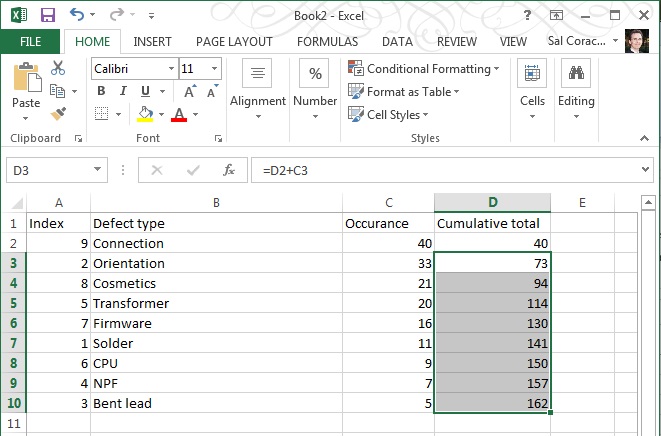
Step Three – Add a column for cumulative occurrence
Basically a formula to add the cell to the one above it, getting larger all down the column – like in the capture below:

Hit ENTER, then – to duplicate the formula for the cells below it, grab the corner of cell D3 and drag the box to the corner of cell D10, as shown:

Your numbers should look like the image below, if it doesn’t then check your formulae.
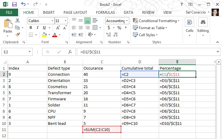
- D2 should be “=C2” [no quotes please!]
- D3 should be “=D2+C3”
- D4 s/b “=D3+C4”
- D5 s/b “=D4+C5”
- D6 s/b “=D5+C6”
- D7 s/b “=D6+C7”
- D8 s/b “=D7+C8”
- D9 s/b “=D8+C9”
- D10 s/b “=D9+C10
Step Four – Calculate Totals, add Percentage
Calculate total of numbers shown in the Occurrence column and add a column for Percentage.
First, add a sum to column C; Occurrence

Then add a formula to column E that uses the total you just made as shown below:
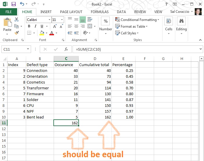
Make sure your totals match (D10 should be the same as C11)
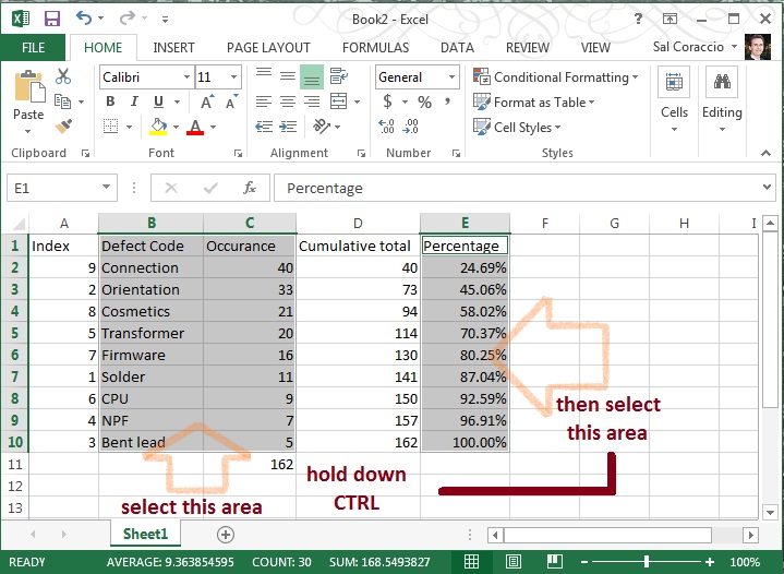
Go ahead and format that Percentage column to be a percentage with two decimal places, like so:

NOW – The numbers should appear as below (if you’re using this example as a first run – which is not a bad idea, right?)

We’re ready to make a proper Pareto Chart
Step Five- Select Columns
This may be a little tricky, so follow closely. First, using the mouse, select B1 to C10 (two columns), THEN – Without Clicking Anywhere Else – hold down the CTRL key AND using the mouse, click E1 to E10… You should have two selected areas now that look like this:
With those areas still selected click “Insert” / “Insert Combo Chart” then the centered chart type pictured – it is called “Clustered Column – Line on Secondary Axis”. Navigate to it as pictured below:

Wow. We’re almost done – should look something like this:

Step Six – Clean Up
We need to adjust that axis on the right and add a title, and whatever else you’d like to do to pretty this up.
To change the axis, right click in the body of that section of the chart and select “Format Axis”,

then change the number (1.2 in this example) to 1.0:

Et Voilà! You’re done! Once you’ve done a few it actually becomes quite easy. We ended up with something like this here:

Now you’re ready to incorporate it into your next management meeting, and use it to get the resources you need to fix the vital few, leaving the trivial many for another day.
To review the concept and uses behind the Pareto Chart tool, we covered that in last week’s Toolsday.
Thanks for following along, and if you’ve got any strength left, go forth – and calibrate thyself.
Sal
P.S. I hope you’ve found this post helpful, can I ask you to look at this offer? I’ve used Audible for over 10 years – it really is a wonderful resource.
Thank you.